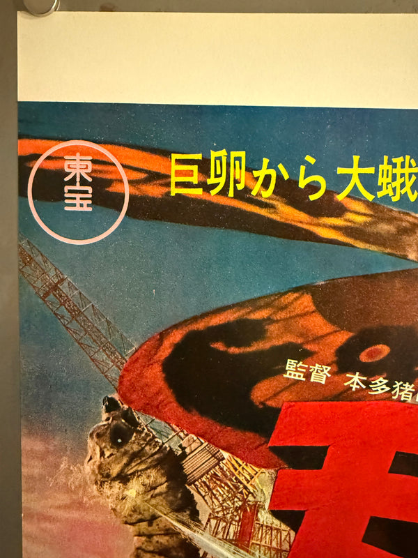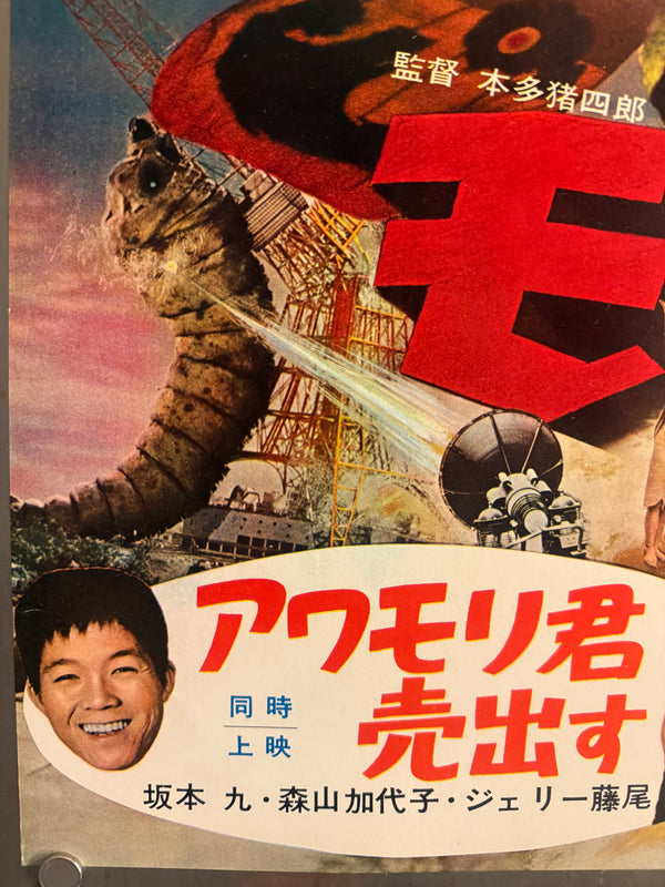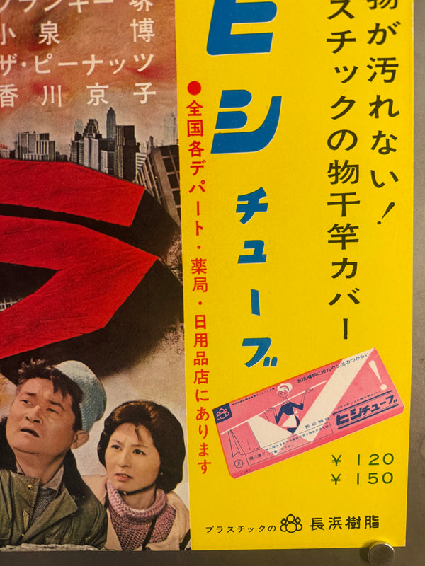
“Mothra” (モスラ), Ultra‑Rare Original Japanese First‑Release Nakazuri B3 Train‑Hanging Poster / “Tie‑Up” Advertising, 1961 Japanese Debut of Mothra, Ultra Rare — B3 Size (approx. 36.4 × 51.5 cm) Professionally Conserved (Washi Restoration)
This first‑release B3 nakazuri for Mothra is an exceptionally scarce survivor from the film’s original 1961 campaign—a commuter‑facing, train‑hung advertising format that was never meant to last. Vintage kaiju nakazuri are dramatically harder to find than standard theatrical posters, and tie‑up variants (combining film + consumer product promotion on one sheet) are among the most elusive of all.
Issued for railway car interiors, nakazuri (中吊り) are posters hung from the ceiling in the center aisle so they remain visible even in crowded trains. They were typically produced in the “single” B3 format (with “wide” versions using two B3 sheets side‑by‑side), and modern media guides still describe B3 as the basic standard for nakazuri placement. Because these ads were displayed briefly (often only days at a time) and then replaced, survival rates for early‑1960s examples are extremely low—especially for paper items tied to specific release dates and retailer tie‑ins.
Tie‑up significance (タイアップ)
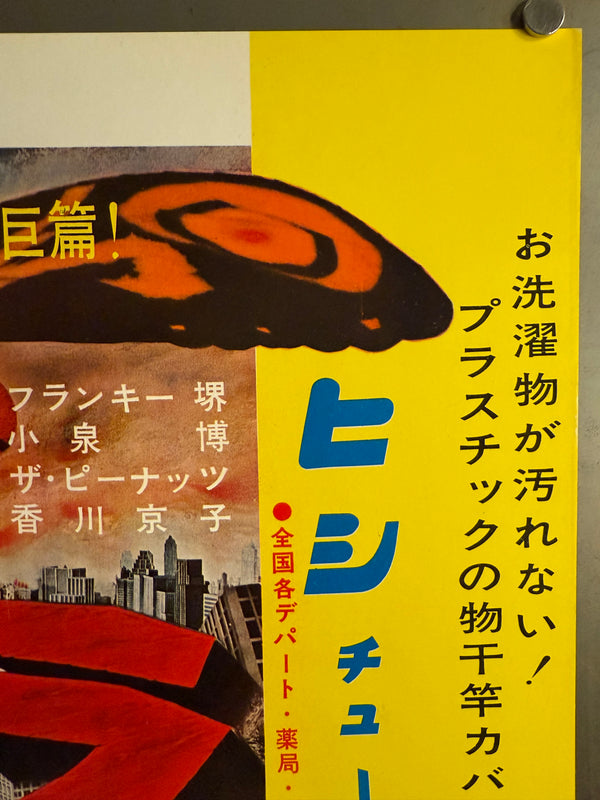
This sheet is also a classic Showa‑era tie‑up (タイアップ) advertisement: it promotes Toho’s Mothra alongside a consumer product—the ヒシチューブ (Hishi Tube) plastic clothesline‑pole cover—complete with pricing and nationwide retail call‑outs. In Japan, “tie‑up advertising” broadly means multiple parties collaborating on a shared promotional campaign, a practice deeply rooted in post‑war/Showa marketing culture. The result here is a hybrid object: kaiju key art + department‑store product promotion, designed to reach everyday commuters at scale.
About the film
Toho’s 1961 spectacle Mothra (モスラ)—released in Japan on July 30, 1961—is a cornerstone of the studio’s tokusatsu legacy. Directed by Ishirō Honda (本多猪四郎) with special effects by Eiji Tsuburaya (円谷英二), and produced by Tomoyuki Tanaka, the film stars Frankie Sakai, Hiroshi Koizumi, Kyōko Kagawa, and The Peanuts as the Shobijin.
Often cited as a landmark for Toho’s monster cinema, Mothra pushed the genre into a more fantastical, mythic register—and Japanese film writing frequently notes its significance as an early color / wide‑screen kaiju showcase created by Toho’s celebrated tokusatsu team. Its origin is also unusually literary: the underlying story concept is credited to Shin’ichirō Nakamura, Takehiko Fukunaga, and Yoshie Hotta, later adapted for the screen by Shinichi Sekizawa.
Poster design
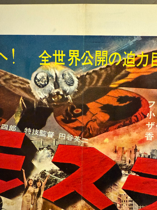
This B3 nakazuri tie‑up design is a masterclass in early‑60s Japanese film advertising: bold photomontage spectacle, high‑contrast color blocking, and instantly legible typography engineered for a moving commuter audience.
Key Japanese copy (with translations)
-
巨卵から大蛾へ! = “From a giant egg to a giant moth!”
-
全世界公開の迫力巨篇! = “A powerful epic released worldwide!”
-
監督 本多猪四郎 = “Director: Ishirō Honda”
-
特技監督 円谷英二 = “Special Effects Director: Eiji Tsuburaya”
-
総天然色 = “Full color” (literally “total natural color”)
-
30日 東宝系封切 = “Opens on the 30th at Toho theaters” (a first‑run date call‑out)
Graphic composition and impact
-
The left field is dominated by Mothra’s larval form, rendered with gritty texture and scale cues (industrial steelwork, machinery, smoke) to sell the “realism” of destruction.
-
Above, the adult Mothra spans the top in a dramatic, wing‑to‑wing reveal—its orange‑and‑black patterning acting like a natural “banner” that leads the eye across the headline copy.
-
The title モスラ appears as enormous red, blocky, shadowed lettering, angled and segmented to feel like a physical object crashing through the scene—pure Toho graphic bravura.
-
At the bottom, the layout pivots into period programming information: the double‑feature billing (同時上映) and celebrity portraits are arranged for quick scanning.
-
The right third becomes a hard‑edged vertical yellow advertising panel—a striking color break that turns the sheet into a true film + product tie‑up. The oversized blue ヒシチューブ lettering is intentionally simple, “brand‑first,” and readable at a glance.
A uniquely nakazuri detail: the large white top margin is consistent with train‑hanging production norms—designers commonly leave space at the top for the clip/holder area.
Why collectors prize this example
First‑release, date‑specific campaign piece: the printed 「30日 東宝系封切」 call‑out anchors this to the original launch window for Mothra’s 1961 Japanese release.
True nakazuri format scarcity: train‑hanging B3 ads were designed for short cycles and replacement; modern rail media guides still frame nakazuri as a standardized, time‑boxed placement—exactly the kind of paper ephemera that rarely survives across decades.
Showa “tie‑up” hybrid: part kaiju spectacle, part household‑goods promotion—an eye‑catching example of Japanese タイアップ広告 culture, where multiple parties share a single promotional surface.
Distinct design variant: unlike standard national theatrical one‑sheets, this sheet integrates double‑feature billing and a full retail product panel, creating a visually and historically distinct campaign artifact.
Museum‑grade context: Japanese institutions explicitly document and exhibit film‑poster history as a major part of cinema culture—Toho tokusatsu titles like Mothra appear within that recognized poster lineage.
Conservation
Professionally conserved and backed with traditional Japanese washi to stabilize the sheet for long‑term preservation and display. Japanese conservation practice commonly emphasizes safe materials and reversibility —frequently using washi and wheat‑starch paste for repairs and backing, precisely because these methods are stable and can be undone by future conservators if needed.
In practice, this museum‑standard approach typically involves thin, sympathetic Japanese papers (often kōzo‑fiber washi) and carefully prepared starch paste to reinforce folds/tears while keeping the object flexible rather than brittle. The result is a flatter, stronger, better‑handling poster that still respects the original paper.
Condition
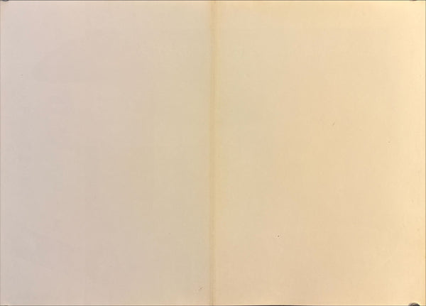
Excellent on conservation washi backing. Colours remain richly saturated with strong contrast. The original central fold is now cleanly supported and presents smoothly; minor edge stress and small handling traces typical of a hung transit poster have been stabilized by conservation. Light, normal age‑appropriate toning is limited to the verso (as expected for Showa paper). Overall presentation is crisp, vibrant, and ready to frame. Please review the provided photos (front and back) — they show the exact poster offered.
It is over 64 years old.
It is not a reproduction or a reprint.
Certificate of Authenticity included.
