TOKYO STORY / 東京物語 Japan (Shochiku), 1953 Original first-release Japanese theatrical poster (B1 / tate) Colour-printed poster on paper, professionally conserved and backed with traditional Japanese washi
TOKYO STORY / 東京物語
Japan (Shochiku), 1953
Original first-release Japanese theatrical poster (Slightly Larger than B1 Size / tate)
Colour-printed poster on paper, professionally conserved and backed with traditional Japanese washi
A “holy grail” of Japanese cinema paper: the first-release B1 for Yasujirō Ozu’s Tokyo Story—a poster whose scale, age, and survival rate place it among the rarest and most coveted Japanese film posters. In our experience, this is a once-in-a-generation discovery: the kind of sheet that surfaces perhaps once in 25 years, if at all.
“A sheet whose scale, age, and survival rate place it among the rarest and most coveted Japanese film posters ever to reach collectors.”
This exact poster has been held in a private collection for almost three decades, and to our knowledge, no other copy is publicly known to exist—placing it firmly in the realm of institutional-grade rarity.
Key Facts
Film: Tokyo Story (Tōkyō Monogatari / 東京物語)
Director: Yasujirō Ozu (小津安二郎)
Studio: Shochiku (松竹)
Release: 3 November 1953 (Japan)
Poster format: B1 (approx. 73.5 × 104.8 cm) — the larger, theatre-display standard in Japan
Conservation: Museum-standard washi backing for long-term stability and display (details below).
Rarity and Market Context
A first-release B1 that virtually never appears
B1 posters were designed to command attention in cinema lobbies—large, impactful, and often handled hard. For early-1950s Japanese releases, survival is especially low: thin postwar paper, routine folding for shipment, and the simple reality that cinema ephemera was rarely saved.
Auction visibility: B2 exists; B1 is (to us) undocumented
We have not found a publicly documented sale of the Tokyo Story first-release B1 in the major, searchable Western and Japanese auction archives and public listings we reviewed. We have also made detailed inquiries with the top collectors in Japan who are only aware of this exact copy which was sourced by Japan Poster Shop privately. What does surface publicly are smaller formats—notably B2.
Important note: proving a negative is inherently difficult—private treaty sales and unindexed domestic sales may exist. However, based on the public record we can verify, a first-release B1 appears absent from documented auction history, this is an exceptional “institutional-grade” rarity.
Yasujirō Ozu and the Status of Tokyo Story
Ozu: a pillar of world cinema
Yasujirō Ozu is widely regarded as one of cinema’s defining auteurs—celebrated for formal precision, emotional restraint, and an unparalleled ability to express time, family, and loss through seemingly ordinary domestic life. Tokyo Story is repeatedly singled out as the summit of that achievement.
The film: deceptively simple, emotionally devastating
In BFI’s framing, the film is a devastating story of elderly grandparents brushed aside by their self-involved family, and the culminating statement of Ozu’s loosely connected “Noriko” cycle.
How the Film Is Ranked
Sight & Sound / BFI: a perennial top-tier “greatest of all time” fixture
Few films can claim what Tokyo Story can: sustained presence at the very top of the most influential “greatest films” polls in the world.
#1 (Directors’ Poll) — Sight & Sound (BFI), 2012: voted the greatest film by directors in the decennial poll.
#3 (Critics’ Poll) — Sight & Sound (BFI), 2012: ranked third in the critics’ list of the 100 greatest films.
#4 (Critics’ and Directors’ Polls) — Sight & Sound, 2022: ranked fourth in both polls.
Japan: Kinema Junpo recognition (published reference)
BFI also notes that Japan’s flagship film journal Kinema Junpo (キネマ旬報) hailed Tokyo Story as the best-ever domestic production in a major all-time ranking (2009).
That poll is preserved in print in the Kinema Junpo “mook” publication 『オールタイム・ベスト映画遺産200〈日本映画篇〉』 (Kinema Junpo Sha), a formal bibliographic publication record.
The B1 Format: Scale, Age, and Why Survival Is So Uncommon
Japanese film posters commonly exist in multiple standard sizes; B2 is the format most often encountered, while B1 is the larger, more display-forward sheet—and correspondingly more prone to wear, loss, and disposal.
For a 1953 first release, the calculus becomes brutal: a large-format, working-life object meant to be used and replaced. The result is that true first-release B1 survivors for canonical titles can be rarer than many collectors ever encounter.
Handling-level comparison: in our own experience, the closest analogue in “how seldom you see one” is the Dr. No billboard we previously placed—acquired after public institutional display (NFIJ exhibit provenance), and similarly “once-in-years” in opportunity. This Tokyo Story B1 belongs in that same scarcity tier.
Poster Design: A Masterclass in Japanese Studio-Era Elegance
This sheet is extraordinary not only for rarity, but for design intelligence and emotional temperature:
Composition and imagery
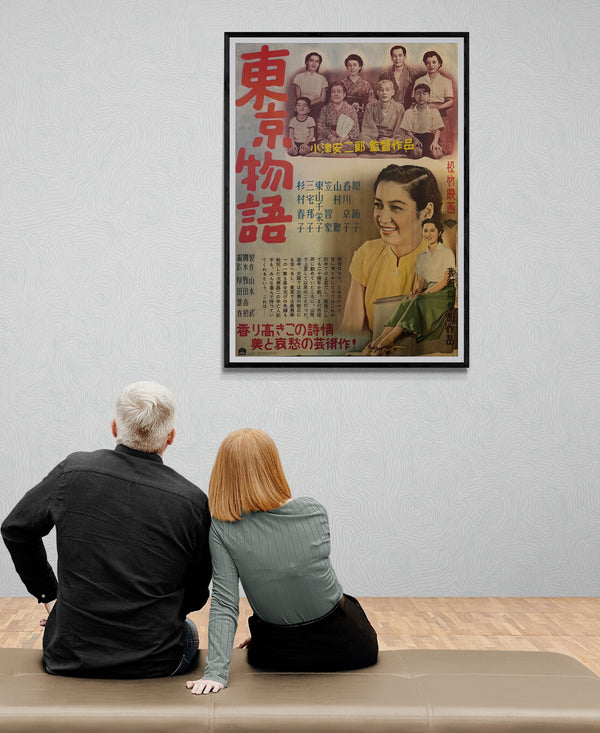
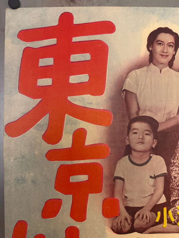
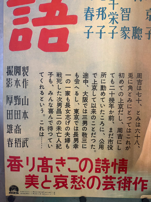
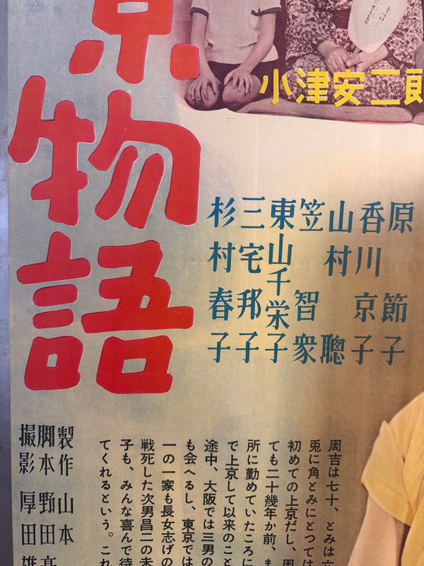
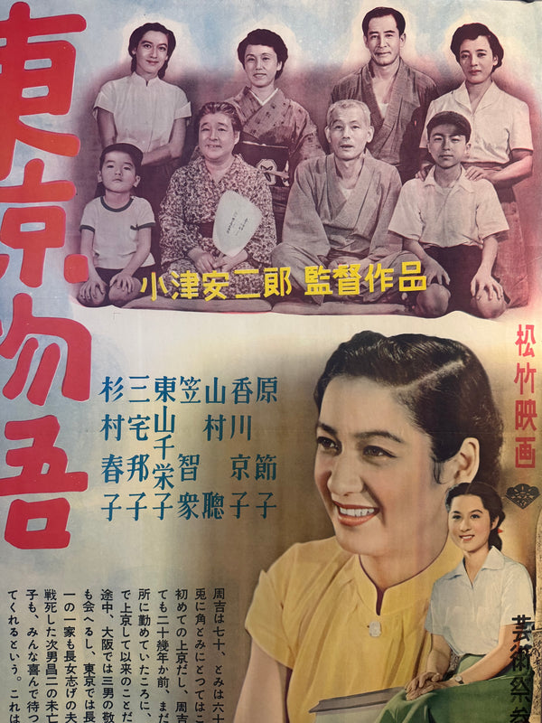
Monumental title typography: The film’s title 東京物語 is rendered in bold, oversized red characters running vertically—graphic, immediate, and unmistakably Japanese in its visual authority.
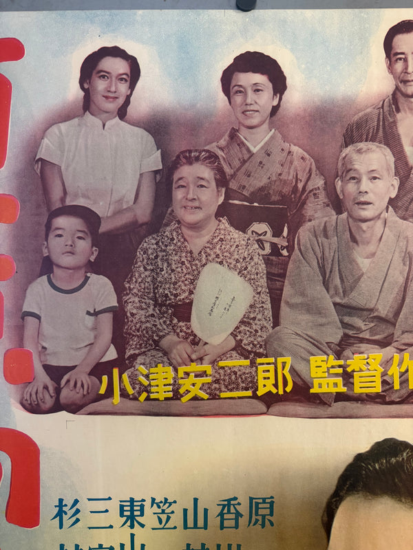
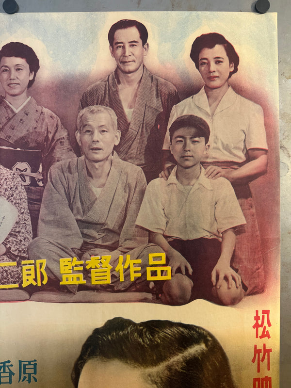
Family tableau: A staged family portrait anchors the upper register—an image of generational structure that quietly foreshadows the film’s emotional architecture.
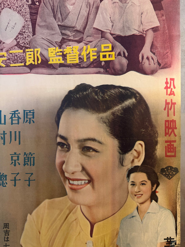
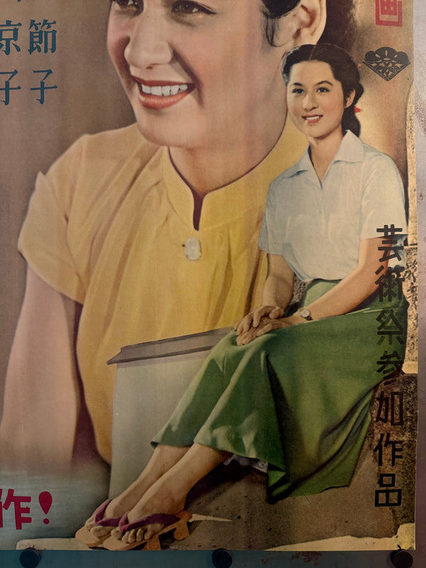
Star portraiture at scale: The lower half is dominated by a luminous, warmly coloured close-up of a smiling woman in a yellow blouse—classic Shochiku-era star presentation—paired with a smaller seated vignette that adds narrative softness and balance.
Colour strategy: restrained, museum-like harmony—red (title), blue (cast), yellow (director credit), and gentle atmospheric gradients—creating exceptional legibility even across a crowded lobby.
Country of origin and studio identity
The vertical studio credit 松竹映画 (“Shochiku Film”) stamps the sheet with unmistakable Japanese origin and the prestige of one of the nation’s major studios.
Text and Translation Notes
Below are the principal on-sheet texts and their English meanings (as printed):
Main title
東京物語 — “Tokyo Story”
Director credit (yellow)
小津安二郎 監督作品 — “A film directed by Yasujirō Ozu” / “Directed work of Yasujirō Ozu”
Studio (vertical, red)
松竹映画 — “Shochiku Film”
Festival note (vertical)
芸術祭参加作品 — “Arts Festival Participation Work” (indicating selection/participation in the Arts Festival context)
Tagline (large red, bottom)
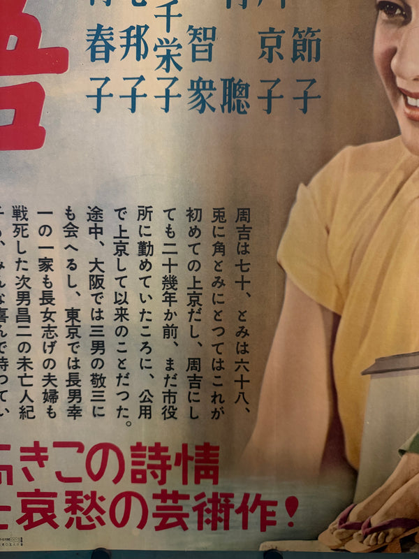
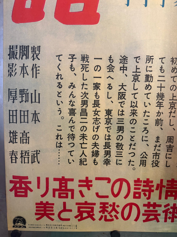
香り高きこの詩情 美と哀愁の芸術作!
“This richly fragrant poetry of feeling—an artistic work of beauty and melancholy!”
Synopsis paragraph (black vertical copy)
This copy describes the elderly couple (Shūkichi and Tomi), their journey to Tokyo to visit grown children, and the family dynamics encountered—closely aligning with the film’s central theme of generational distance and quiet heartbreak.
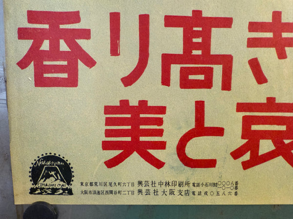
Small printer / company line (bottom left; as printed)
東京都荒川区尾久町六丁目 興芸社中林印刷所 電話小石川(92)〇〇〇八番
“Ogu-chō 6-chōme, Arakawa-ku, Tokyo — Kōgeisha Nakabayashi Printing Works — Tel: Koishikawa (92) ○○○-8” (digits are printed as circles on the sheet)
大阪市浪速区西関谷町二丁目 興芸社大阪支店 電話戎〇五八〇番
“Nishi-Sekiya-chō 2-chōme, Naniwa-ku, Osaka — Kōgeisha Osaka Branch — Tel: Ebisu 0-58○” (final digits as printed)
Conservation
Washi-backed, museum-standard stabilization (excellent, close to near mint presentation)
This poster has been professionally conserved and backed with traditional Japanese washi to stabilize the sheet for long-term preservation and display.
Japanese conservation practice commonly emphasizes safe materials and reversibility—frequently using washi and wheat starch paste for repairs and backing precisely because these methods are stable and can be reversed by future conservators if needed.
In practice, this approach typically involves thin, sympathetic Japanese papers (often kōzo-fibre washi) and carefully prepared starch paste to reinforce folds/tears while keeping the object flexible rather than brittle—resulting in a flatter, stronger poster that still respects the original paper.
Condition
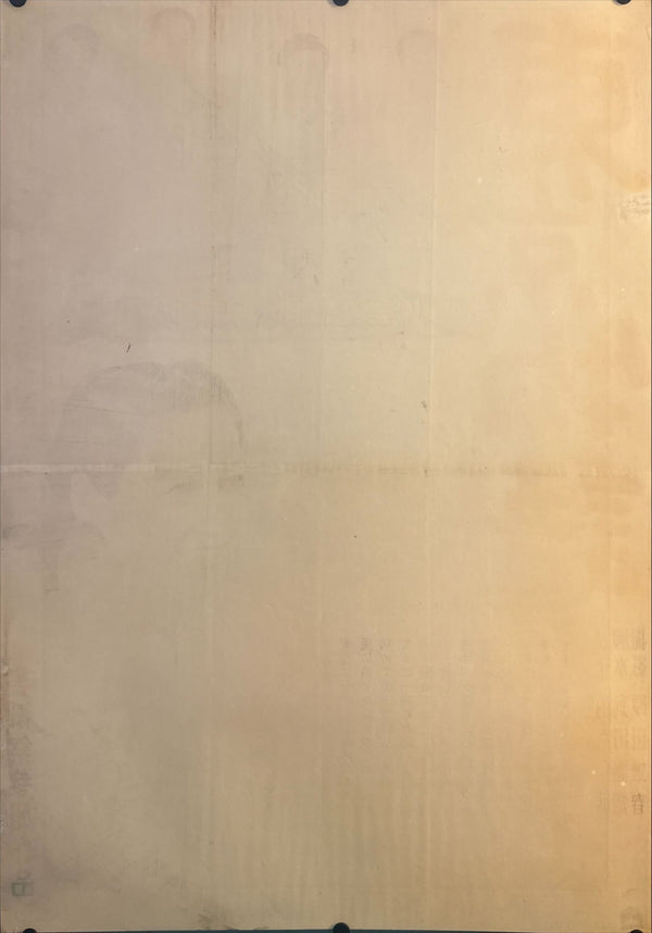
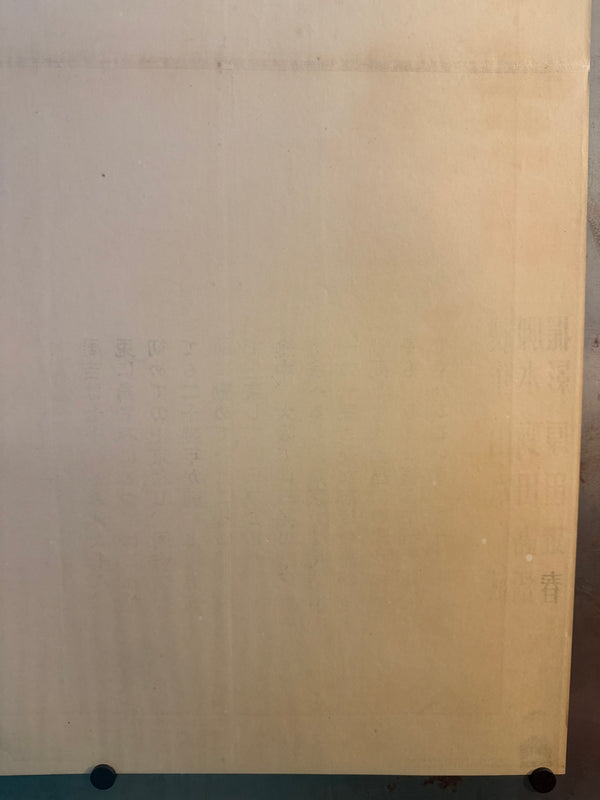
Excellent on conservation washi backing. Colours remain richly saturated with strong contrast. The original central fold is now cleanly supported and presents smoothly; minor edge stress and small handling traces typical of a hung transit poster have been stabilized by conservation. Light, normal age-appropriate toning is limited to the verso (as expected for mid-Shōwa paper). Overall presentation is crisp, vibrant, and ready to frame. Please review the provided photos (front and back) — they show the exact poster offered.
*Please note the price is fixed for this item. It is not included in any of our periodic sales (e.g. Black Friday)!*
